Great Lakes
What's on this page?
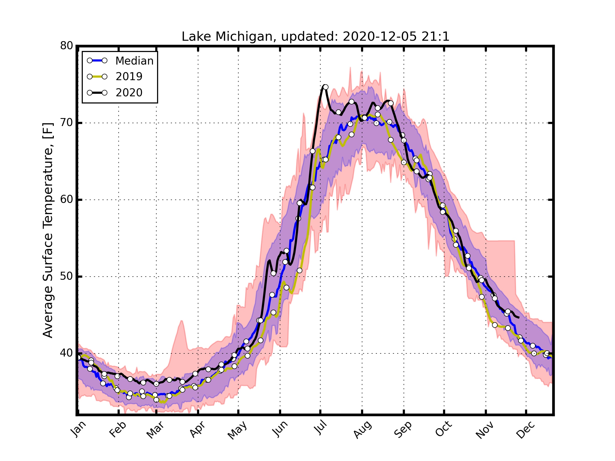
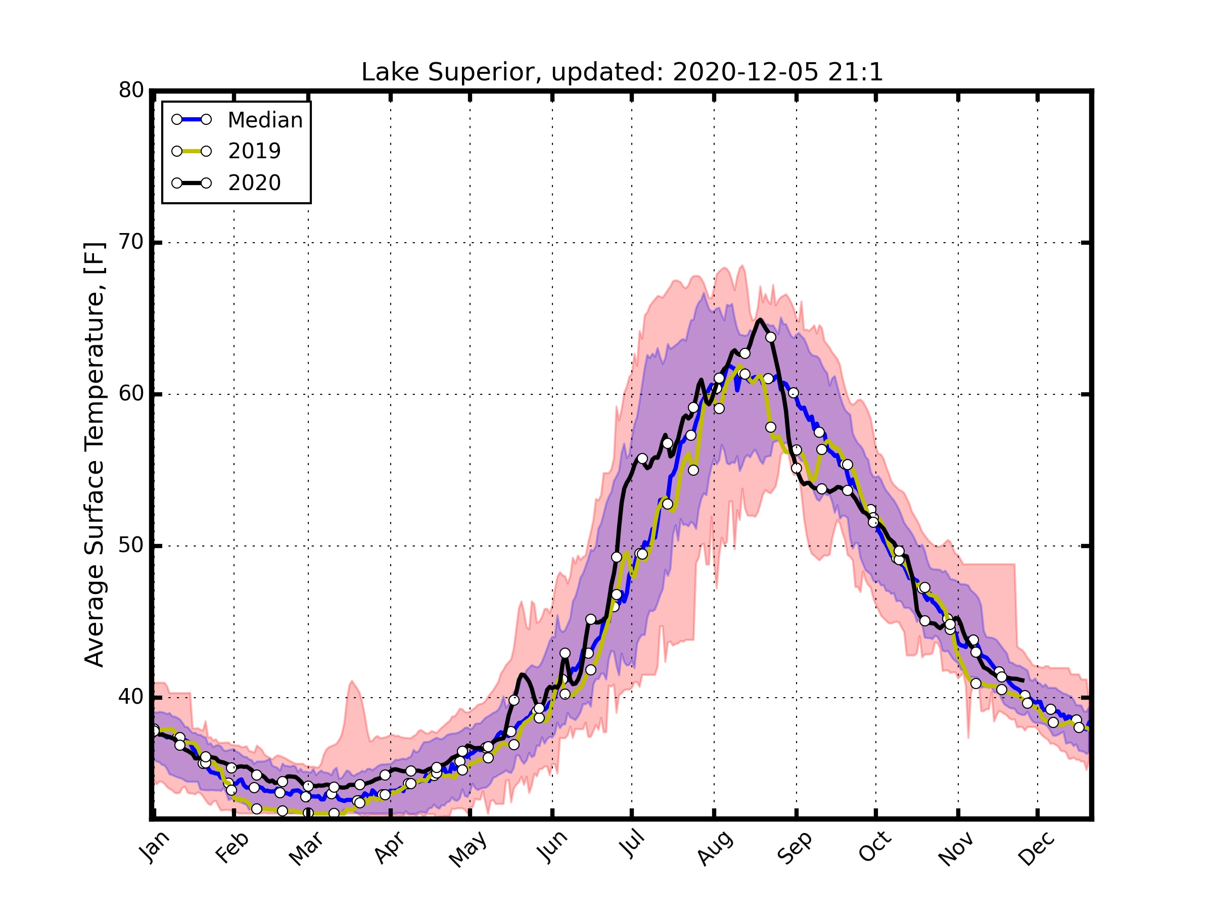
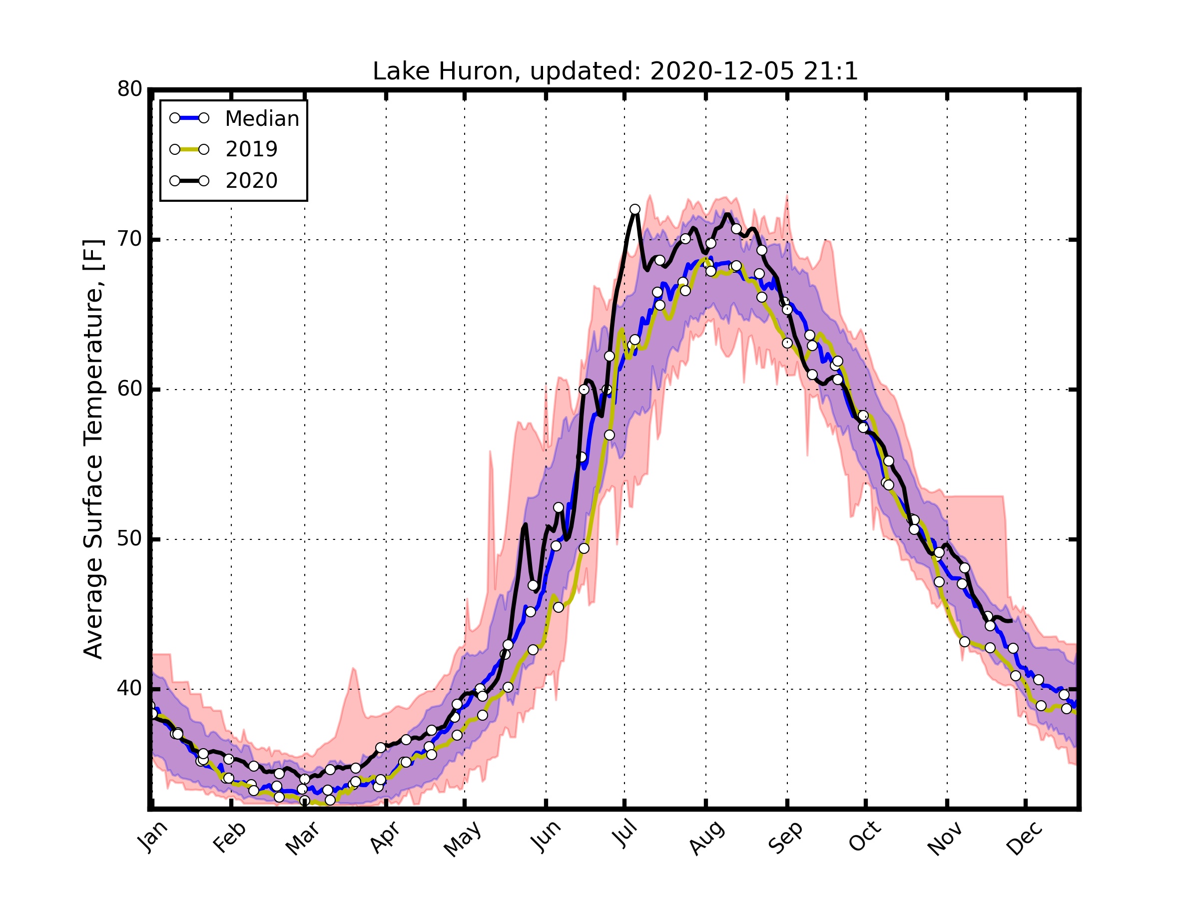
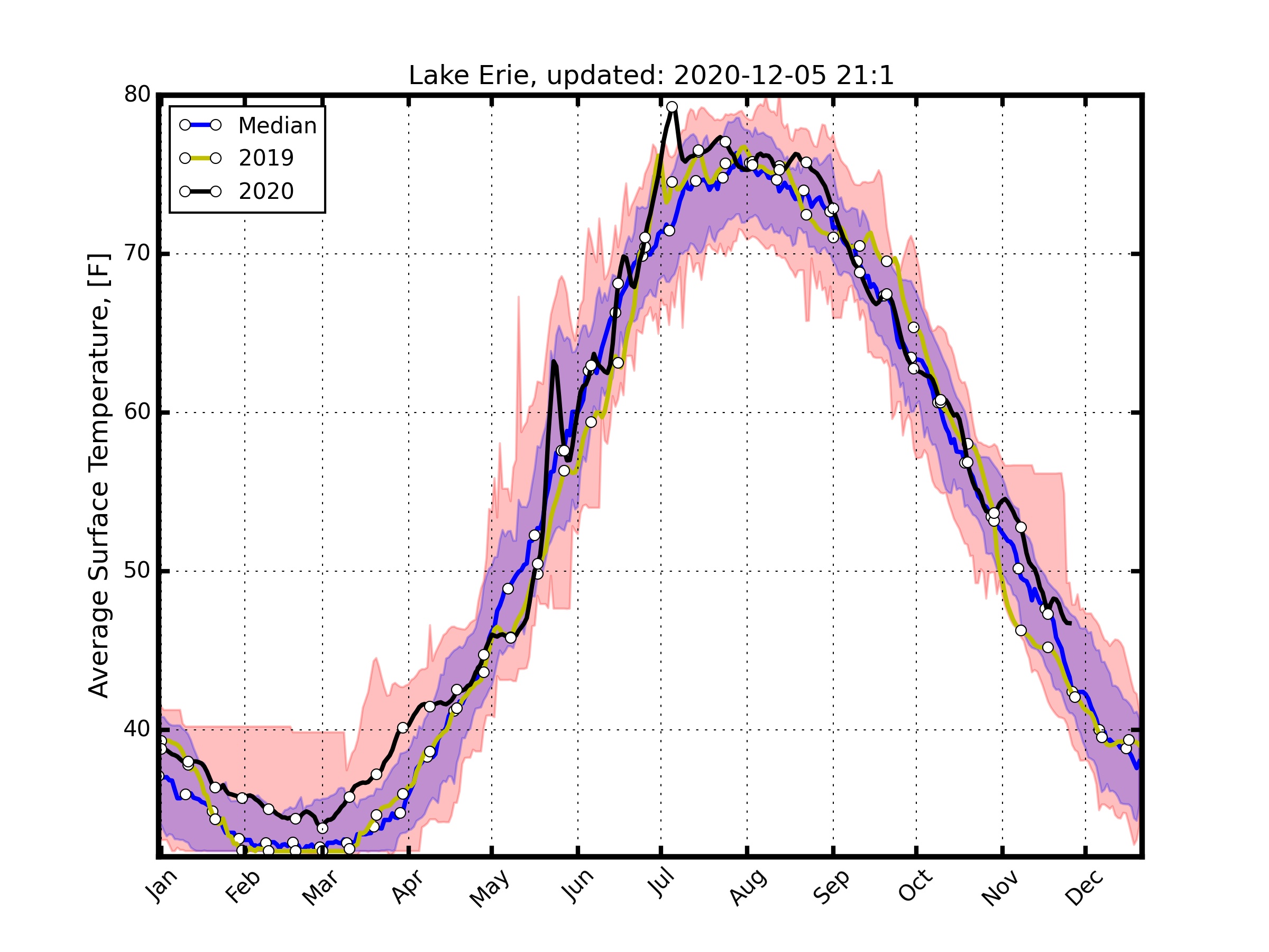
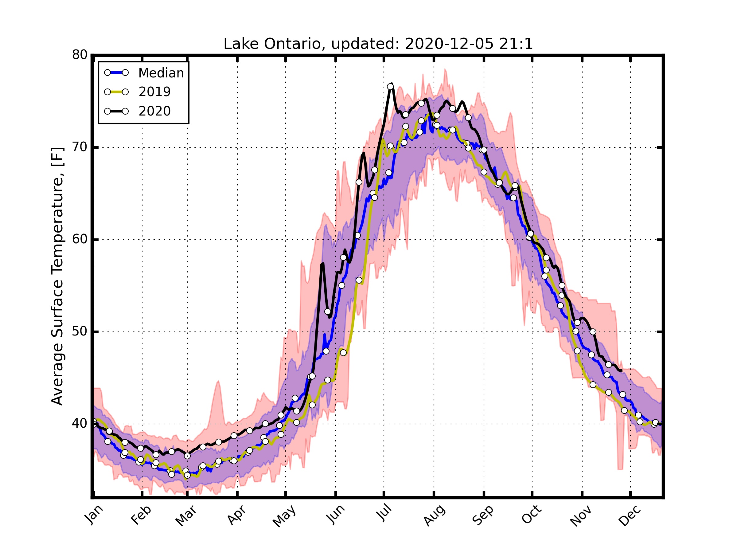
This page contains plots that I made using NOAA’s Great Lakes CoastWatch average lake surface temperature (http://coastwatch.glerl.noaa.gov/). On their website they supply plots where you can compare this year’s temperature to the long term mean temperature, as well as the past 5 years. This is great, unless you want to see how the current data is fairing to all the data collected. For example, if the lakes are at an abnormally high temperature, how high? Record high? Record Low? To answer this I used percentiles and plotted the 1994-2016 year median (blue), the max and min (red shading) and the 10 - 90th percentile (its blue, but with the red underneath it is purple). I thought that this shows a different perspective than what NOAA provides. These plots update every hour at 1 and 51 mins.
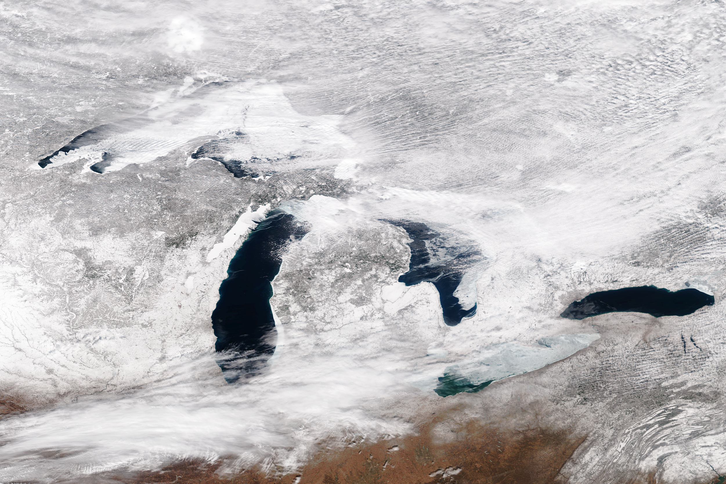
Cavets: Be mindful that these readings come from remote sensing (Satellite) techniques. The satellite retrieves the emitted radiation from the lake surface, calculates the temperature, and then averages that for the entire lake surface. The lakes do exhibit heterogeneity, as apposed to this homogeneous measurement, but it still provides reference to the approximate temperature in the lake.
Snowvember.gif High resolution (101.1 MB) Snowvember.gif 0.5 resolution (49.6 MB) May 1, full res (5 MB)


